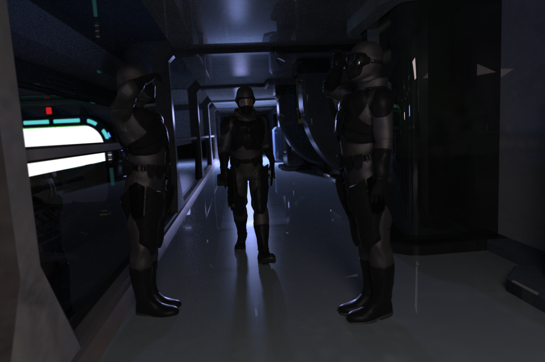
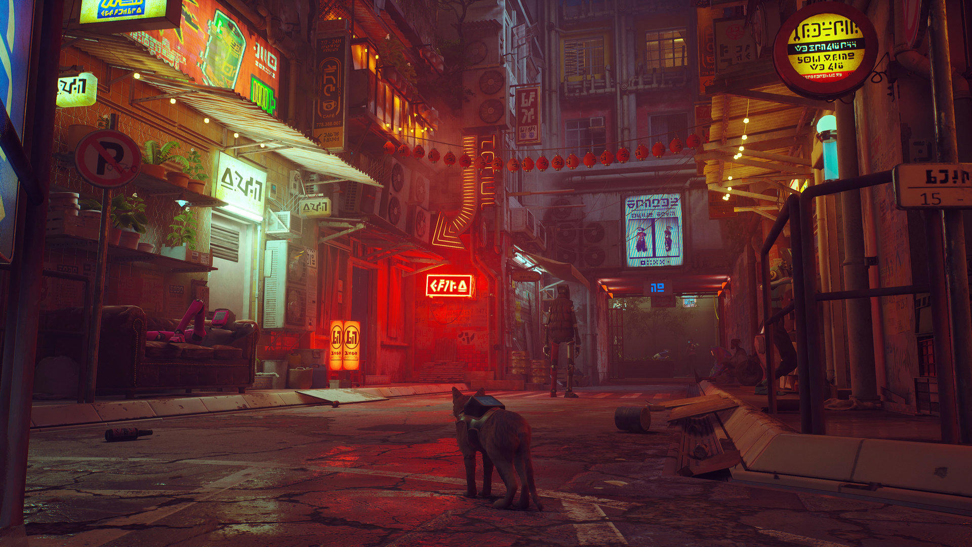
 I’ve put together some more scenes to start to show the extent of the baddie’s lair up on the moon-moon, and honestly it took no time at all! Mostly the problem with this stuff is lighting – it makes such a massive difference to the feel of a place.
It’s all about Chiaroscuro.
The ‘tank garage’ image below is a good example – I wanged a blue light, a white light in there and hit render, hoping that ‘less is more’, and hey presto! I was so happy when this initial render came out that I actually whooped! I don’t often whoop, so it’s a good sign.
So often have I set things up how I think it should be, then put lights in and rendered, and the scenery looks fine but the lighting is bright and vague and boring. It’s always a relief to have something like the below come out of the first render – harsh military lighting, evoking secrecy and quiet might. Stockpiled greed and fear. Perfect.


