 Thought I’d drop the renders that didn’t make it into the latest comic, just for fun. I’ll caption them with what the issue was …
>>>
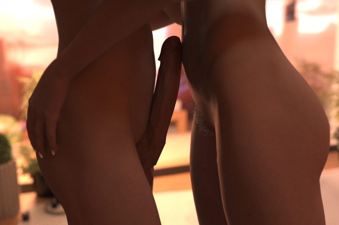
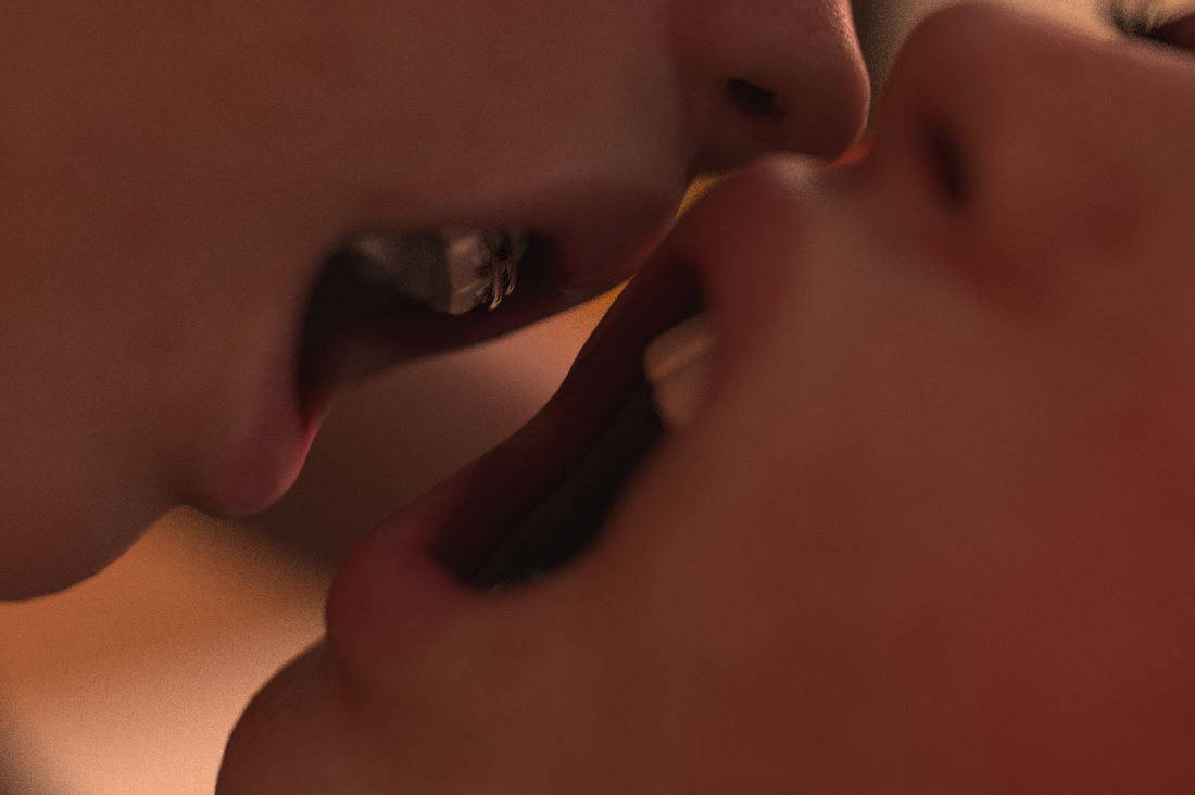
In my head this was a reference to the squeezy willy scene back when Charlie’s wearing that green swimming costume, but I realised nobody’d get that reference, and all it did was slow down what was already a time-critical (because of the music) scene. So I dropped it.
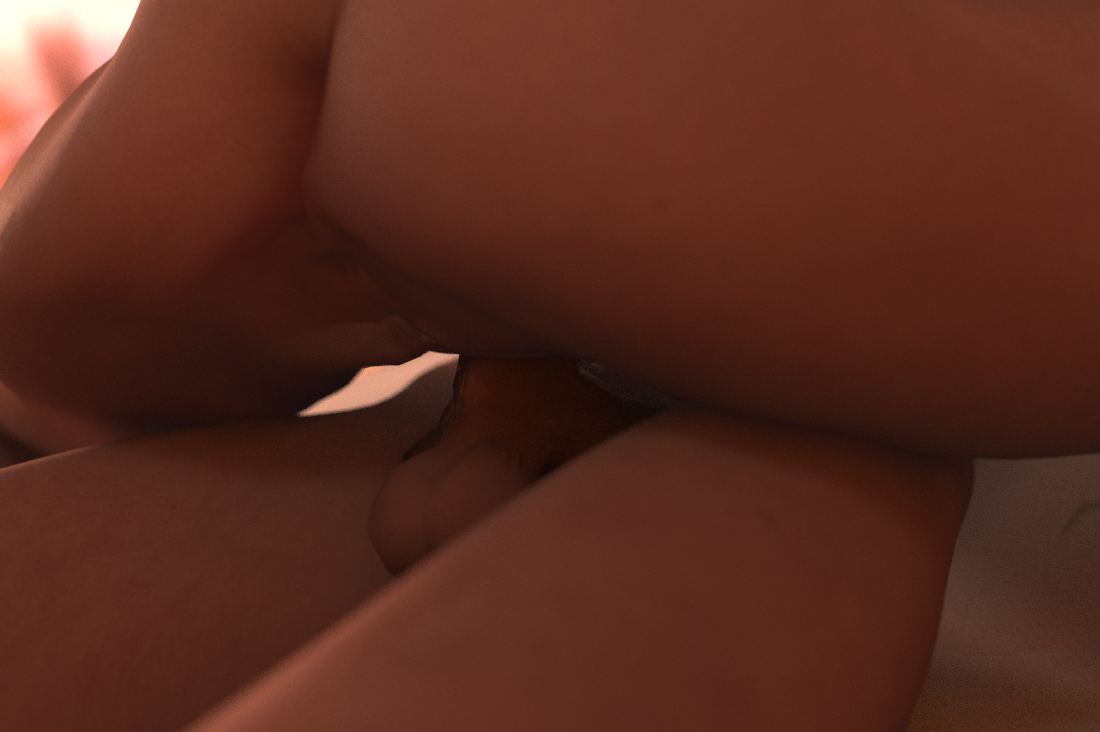
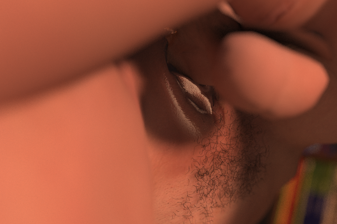
^ This pic just looks crap.
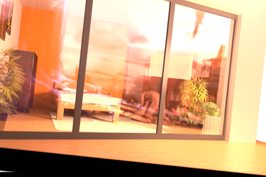
^ The problem with this one is it’s quite a third-party angle, whereas I wanted the reader to be in either Charlie or Jack’s point of view – I wanted the scene to be more visceral, more like you were there, like you’re the one involved rather than someone who walked into Charlie’s bedroom. So I had to ditch this sort of angle.
^ Nothing really wrong with this as a final render I just needed it full-size for the final few pages, so redid it.
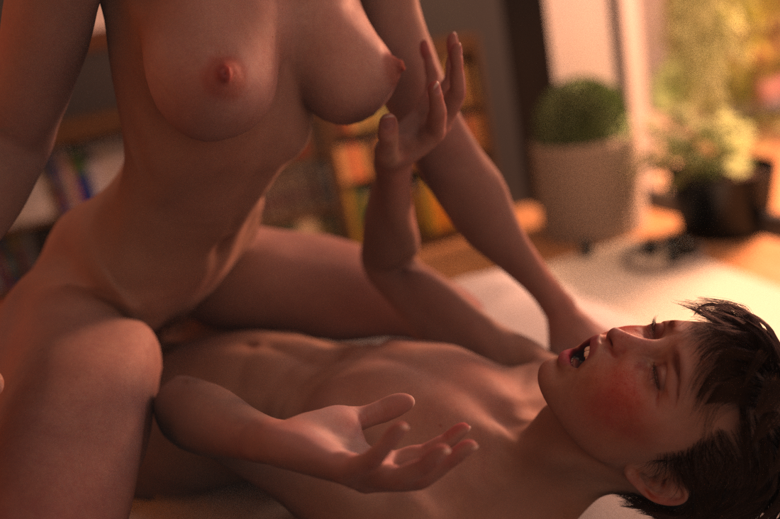
^ I mean I do quite like this one it’s just it slowed down the scene at a critical moment and it didn’t quite feel ‘juicy’ enough to make the cut, that’s all
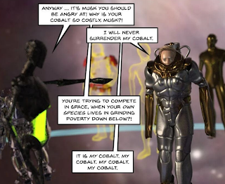
^ This one I ditched because it’s not clear what’s going on! Whatever it is I think the Enterprise is attacking it maybe?

^ Just a bit repetitive in an already needs-to-be-read-at-a-good-pace moment. It’s a nice render but not quite right.

^ This one I just saw it and was like FCKING HECK that needs to be full size WOAH there that came out nicely … think I changed their mouths a little as well.
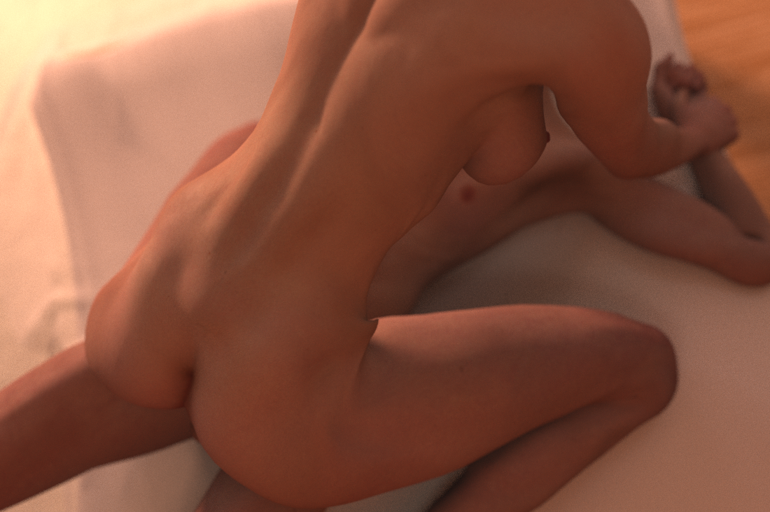
^ This one … I mean what the hell is going on with his arms?! Looked ok in 3D wireframe but not once rendered. I tried to sort the pose out, not sure I quite managed it for the comic but anyway it’s better than this joint-snapping abomination!
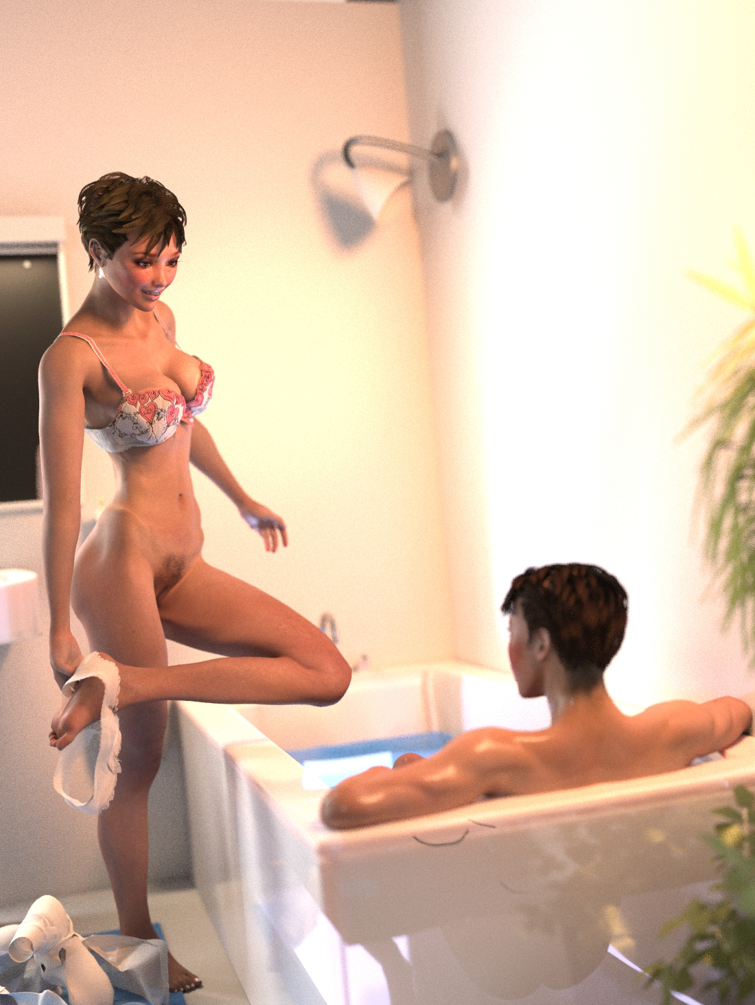
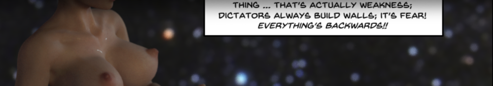
^ Again, the cover that didn’t make it. It’s a lovely pic, just not quite spicy enough. And that mirror looks weird reflecting black when there’s no black in the room …?