Okay here’s a few test covers which I tried for the first Kinfolk comic. And then I want you to help me decide which cover to use for the second comic (out soonish).
Comic #1 cover tests:
 ^ I thought this was a strong contender because I just liked the layout. Then I thought the best bit was when Jilly took her top off out on deck, so it was nearly this:

… but the layout doesn’t really work on that, so finally I settled on this one, which I couldn’t resist because the pose, the lighting, the boob-squish … it all just kinda worked:
… and I’m not sure I’ll match that because wowee it did work pretty well. Aaaaaaanyway … now I’m at the stage of having the same ponderings with the new comic, so help me decide by VOTING! (or commenting, below)
NEXT COMIC – potential covers:
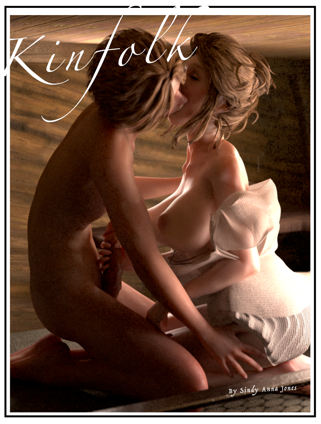
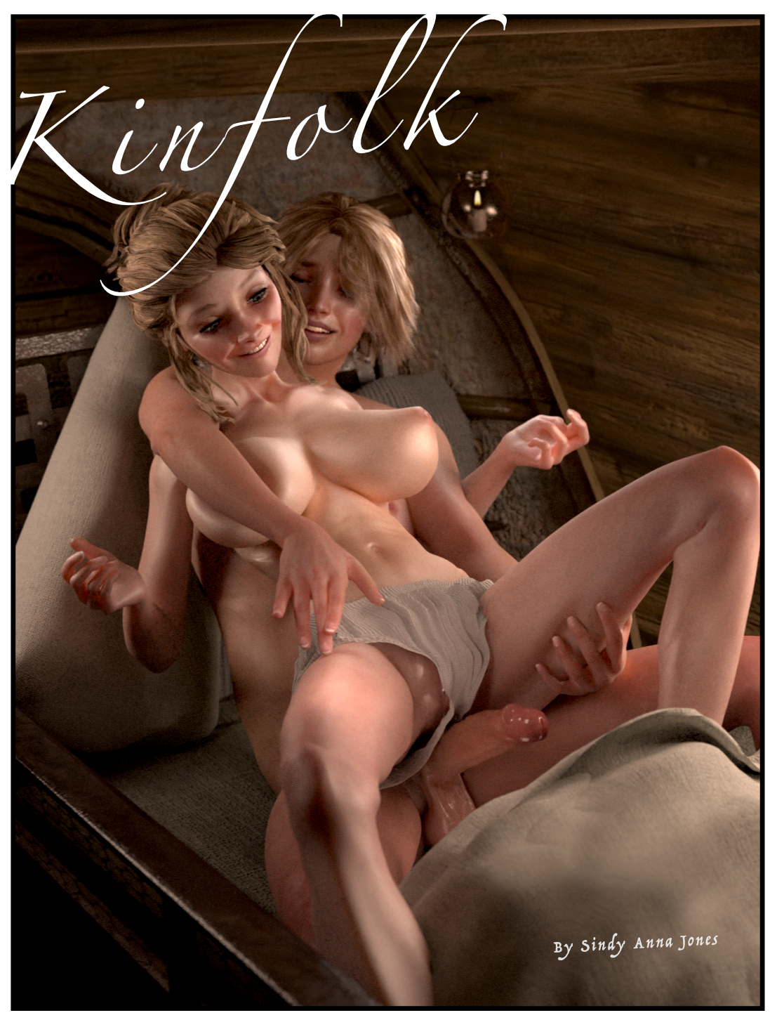
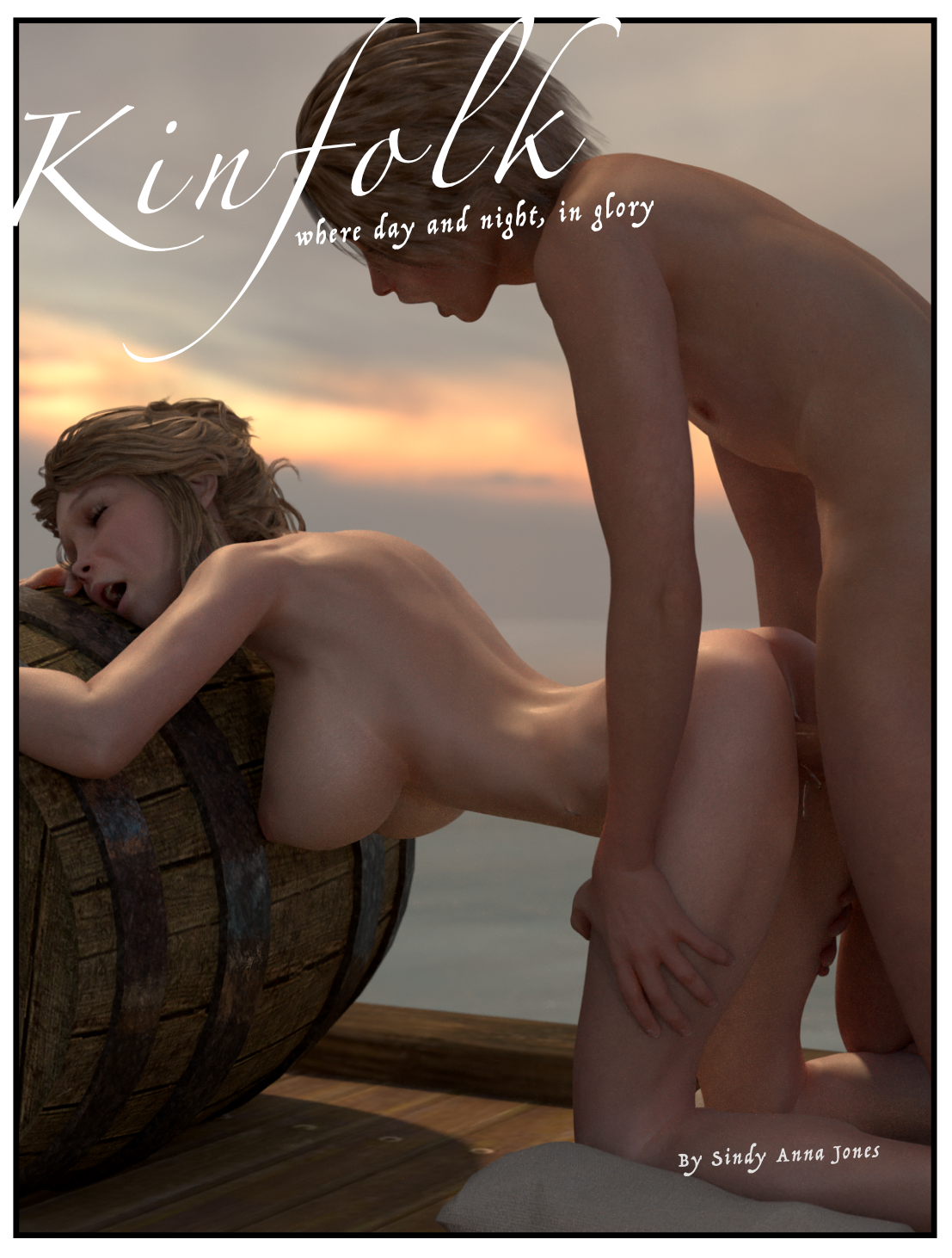
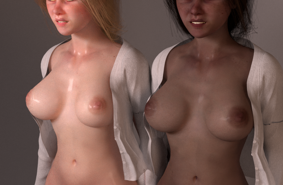
1:
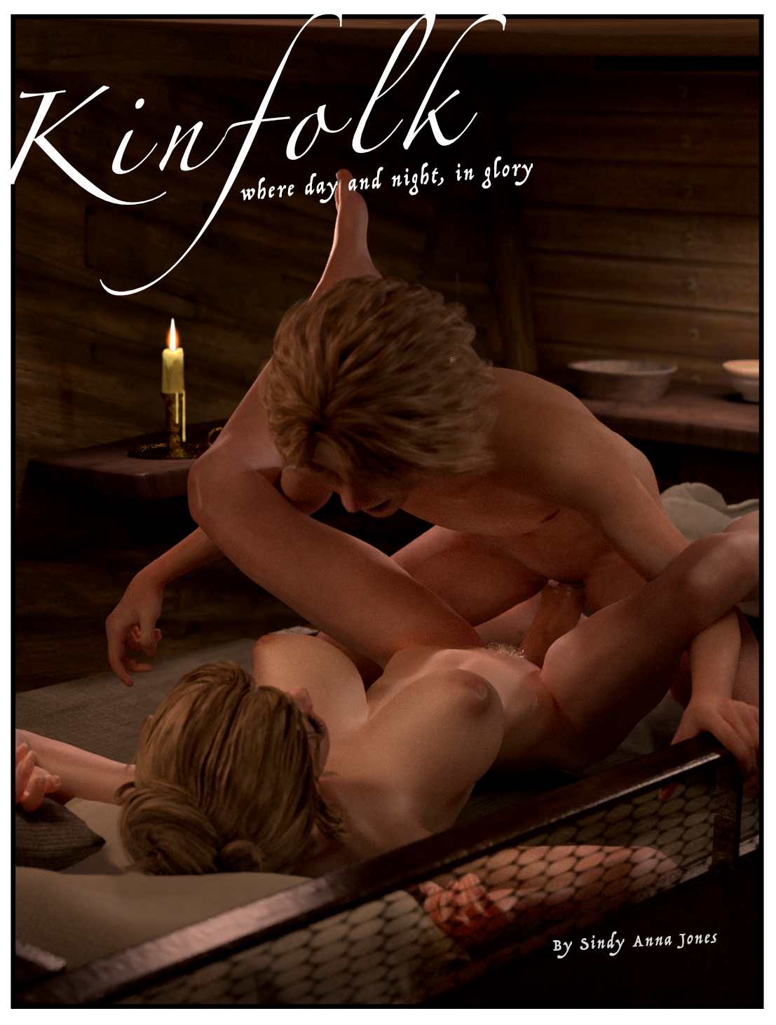
2:
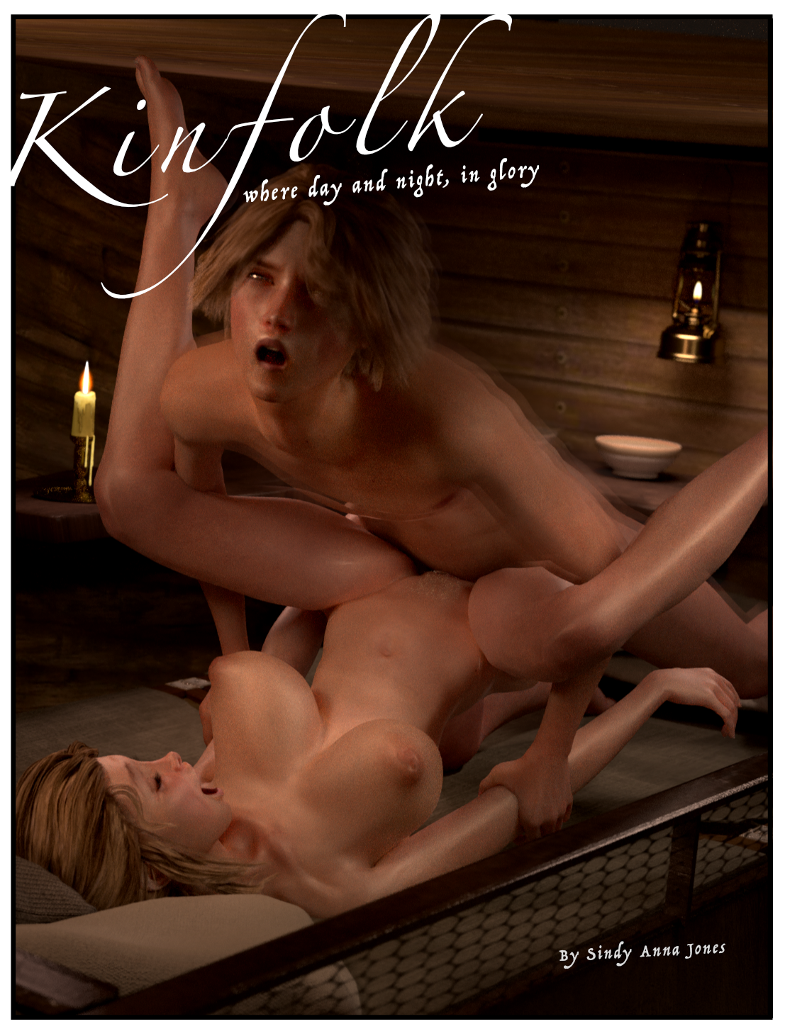
3:
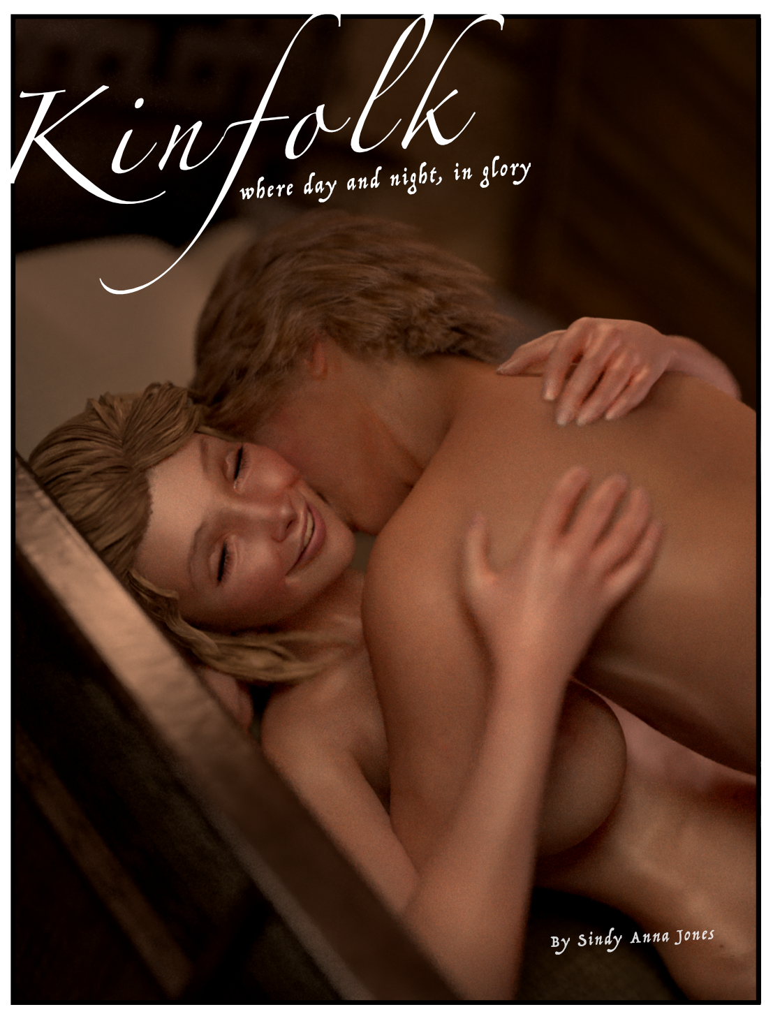
4:
OKAY! VOTE! (Update: too late! Votes are in)
(I mean you might as well vote if you like, click the button, always fun!)
I actually liked the cover test two best. It’s like getting a gift. The cover/wrapping is dull, meaning to be festive but falling short, though when you open it, you get a special surprise.
If I have to choose, then #4 it’s not blatantly in your face. We know what’s coming, make us wait.
If any of this makes sense
One of the greatest things you’ve done with your covers has been to give us a taste without feeding us with a spoon. Lithium #7 is the prime example of this because by the time you get to that book “it didn’t count”, so how are they going to keep it from counting and are they going to ever “make it count”. The first 3 covers blatantly let us know that sexy times they are a coming (pun totally intended) but the last one shows more of the reason why they are even on this journey together: love. Jilly sacrificed so much jumping onto that boat and being able to see her with that much of a satisfied smile is something that I found the best feeling for the cover. The others, sure we may get to see those, but knowing that Jilly doesn’t regret anything from jumping onto the moving ship and she’s actually happy and content? Chef’s kiss.
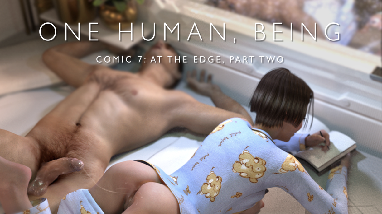
Yeah with recent comics I sort of moved more towards what other comic makers do – show the most explicit thing possible on the cover to draw people in. But I don’t know why I’ve been doing that really – maybe because I was going too far the other way with One Human, Being I think – showing basically nothing – but maybe you’re right and I’ve started going too far towards explicit. Hmm.
Cover #4 for me … not too indecent as a cover should be 😉
👍
Number 4 gets my vote. The headline is better integrated in the picture. I have a soft spot for the tenderness between the siblings. . And it leaves more to the imagination.
🥂🫨
4, 1, 2, 3
They’re all super hot pictures, but I like the more subtle ones for a cover. Like how I hate it when movie trailers give everything away. I mean, we all know there are going to be boobies and willies, but its more of a tease when they’re not already all playing together on the cover. 😉
Yeah and its especially bad when trailers show stuff that isn’t actually in the film! Even worse, I hate that
Yeah. I like 4 too. The joy. The love. We know much more is coming. But the energy that infuses it all is found in that smile.
Hehh, yeah when that render came out I was like “Ah! There’s Jilly. That’s a real smile, that one.” so … yeah, agreed.
I voted 4 since it’s a better cover even though 1 is my fav picture.
Dang! I miss one day and didn’t get to vote. Worse, they’ve been deleted so I can’t even see ’em. Why? Please restore them or post them on DA. Please!
Ah don’t worry, they were slight spoilers so I took them down for a bit. Back up now cos the comic’s dropping as we speak …
Thank you so much Sindy! I really appreciate it! Also loved the comic! Jilly is so hot! I would dearly love to see more boob play (that’s one heckuva set she’s got there!). Nipple play, sucking, licking, tit fucking some or all would be much appreciated!