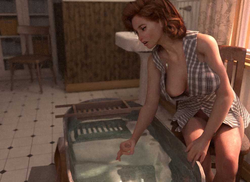
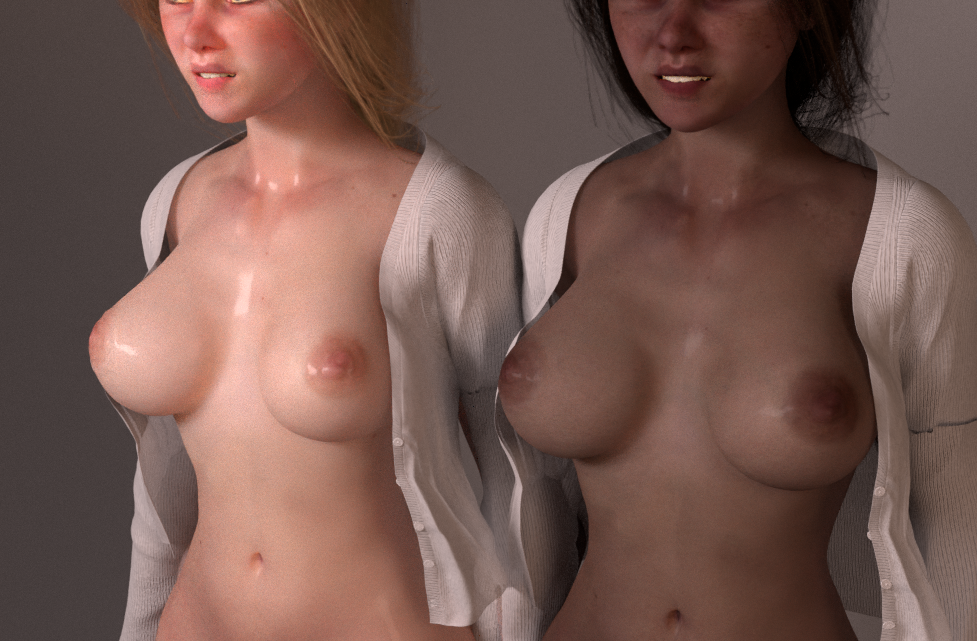
Okay we’re nearly there for the OHB series re-covered releases, but I can’t decide on the final one. I realise these covers are a bit less ‘art’ and a bit more mainstream porn-y than the originals; what I’m trying to do is improve the extent to which the comics are distributed and read. So yeah I’m going for a more booby cover setup.
But which one of these for the final comic ‘Between Two Worlds’? Help me out:

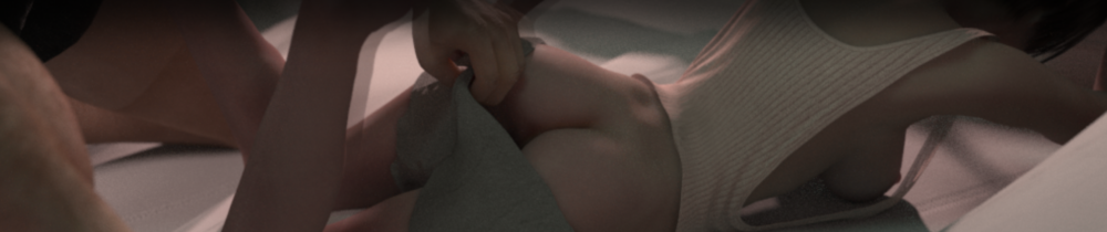
(Steph’s unedited hair is a nightmare of polygons! It won’t look like that in the final thing, obviously)
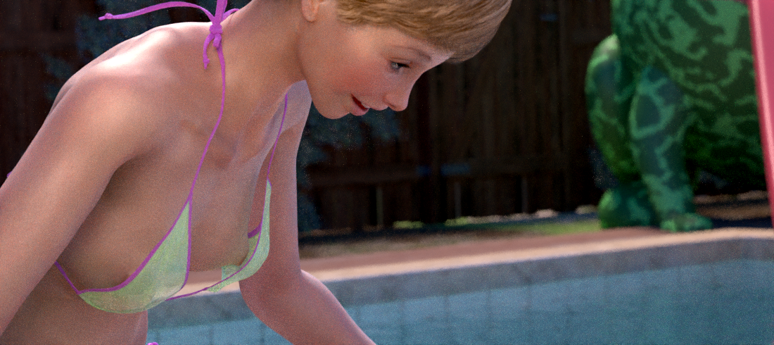
(Suki hasn’t been on any of the other covers, so maybe?)
Neither one, if I had the choice.
As you said, it comes of as porny.
Where as I’d rather see subtlety and sexy. Much of a draw for me to read than, than going for the juice bits right off the bat.
Personally, I am wrinkling my nose thinking, “this is just another porn comic.”
Nah, I’m trying to reel ’em in with the hook-line-and-stinker technique, those who need the high art version already have it but I’m after increased readership from the masses with this one – and as we know about the masses … they tend to be a little more basic.
You are making a fair point, we are rare breed here 😉
😬😘
The first one is definitely more porn-y (it’s very hot). Yet the second one is more consistent I think with the other covers now. So I would lean more toward the second one.
Vote 👍
I vote for neither. Something less overt … more in line with the philosophy of the comic. Somebody said , “it’s a pretty joyful story”?
Sorry, I don’t like these new covers. I agree with Shades — the new covers look like any other porn comics, while the old ones are more intellectual. I think much more fit the old ones to the story.
Both good. But awesome lighting! As always…
I agree with Shades and SAJ Fan. Even though I love these new covers as well, the originals are by far the best.
That said, let’s get Suki on a cover.
I’m hearing Suki …
Page 068 of the original run of this #6 issue. The one where Steph is inside, buck naked and dad is out in the space suit. You could put the title along the bottom of the ship in the black part beneath Steph.
Would kinda take care of both aspects of what you’re looking for and what other people are asking for about “Intellectual and artsy” rather than “porny”.
Dunno. That’s my worthless 2 cents/p
If you’re looking to be more “porny”, then the more the merrier and a willy is requisite-te-te-te, so the first one wins.
But we know this isn’t really porn, don’t we? OHB is much deeper and more profound than any porn; indeed, more so than most of what is considered serious literature or art.
OHB is more than just porn, and deserves to be marketed as such.
“Porn with a Purpose”
“Coitus for Change”
“Sexy Comics with a Serious Moments are Good for your Mental Health!”
From this perspective, I’d love the cover to reveal a key scene that could make the viewer wonder what the rest of the comic is about. Even including some dialog! Perhaps something with Eep in the misty shower?
Maybe not. Now I want wine gummies.
I agree, which I failed to communicate in the first place.
TBH, I’d say take another swing with Suki in it. I think you’ve got better ideas for her cover under the hood. There’s a old Rolling Stones Cover that had Janet Jackson on it that may provide some inspiration. Outside of that I’m looking forward to seeing what you choose.
Well…….the top one does have more boobies, so it’s got to be the winner.
Agreed with others that it’s a bit too porny. Your strength is in story, subtlety, and the long but. I really like the original cover for this one that leaves a lot to the imagination. It’d be great to have something similar!
Nah – whole point is to get more people to read it, I’m sticking with nudity this time around.
I don’t like either, sorry. They are too porny for my taste and doesn’t really match the complexity in the story; there is so much more than humpy-humpy in there. The original cover changed the same way the cover for part one would be my favorite.
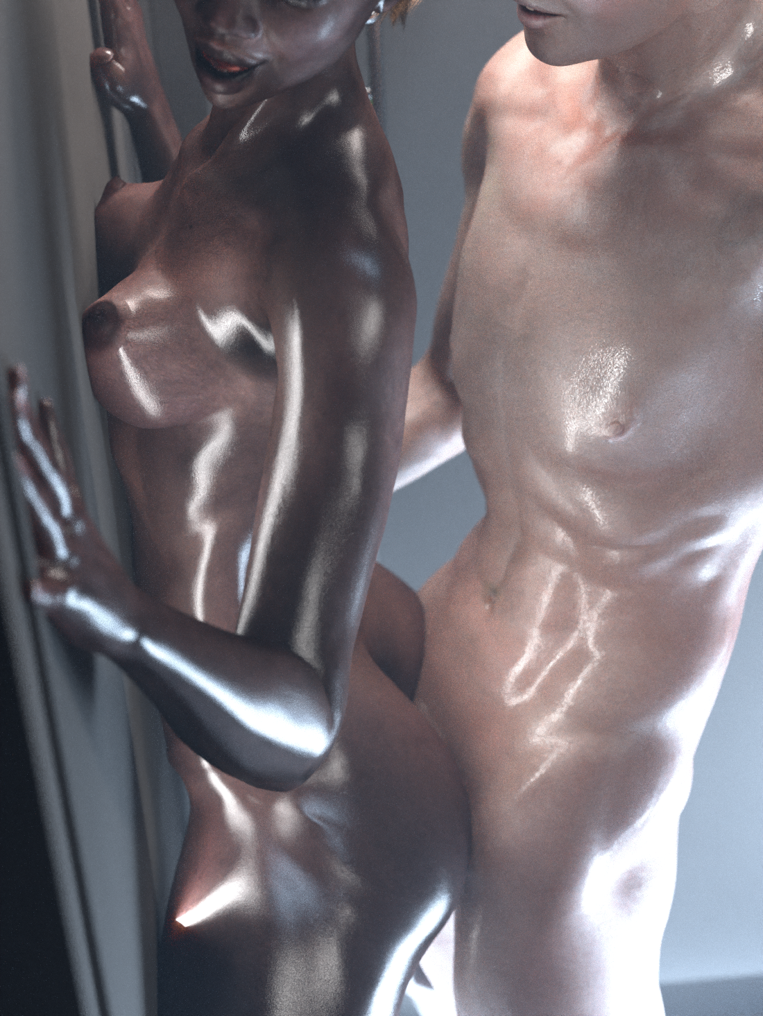
Well I agree with the more porn-y idea as it would increase the circulation. The ideas in it warrant the dip into the obvious and suck-em-in. Nothing better the a dark body contrasted against a pasty white body.
Ah, a comment from someone who hears what I’m trying to achieve, lovely! Yep, people looking to fap generally don’t click on things that have covers that look like they’re straight out of First Edition Folio hardback, so I’m going to veer away from ‘high art’ and steer strait into TITS AND ARSE avenue. Ding ding! Winning vote
Choosing between those two, I think the first one better illustrates Between Two Sisters, er…I mean, Between Two Worlds.